Tuesday 3 May 2016

Evaluation Question 7

Looking back at your preliminary task, what do you feel you have learnt in the progression from it to the full product?

For our preliminary task we did not really experiment with different techniques on PhotoShop whereas for my music magazine i used different tools and techniques.to make the final products.
Our preliminary task did not include a lot of text, also the text that was used was all in the same colour. We did not experiment much with the different types of colours and fonts for the front cover.
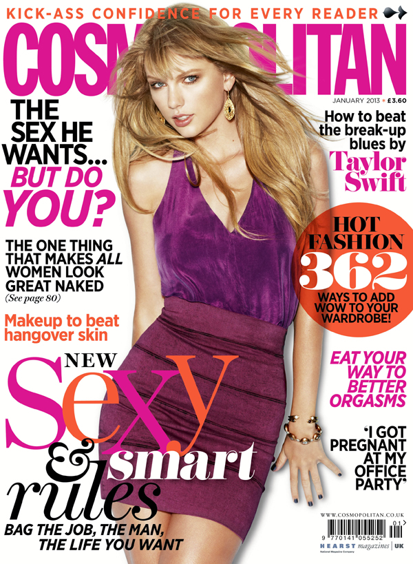
The main focus of our preliminary task was the picture of the model, it takes up most of the front cover and is also quite eye-catching for a young target audience which is what we wanted. Our target audience would have been more interested in looking at pictures than reading a lot of text. I did not like the fact that we didn't really experiment with different colours and fonts for the text used for this task. Also we only included one small bit of text, we should have added some more to make it look informative and more like a school magazine. However what i did like about our preliminary task was that it had a very eye-catching colour scheme. This made the magazine stand out quite a lot as the colour of the text matched what the model was wearing and the text background matched with the picture nicely making it look more effective. This is the idea that i also used for my music magazine. Although i experimented with the colour and font of the text more than my preliminary task, i made sure it matched something that the model was wearing such as her lipstick. This is so that it looks more put together and nothing looks out of place.
 I feel as if i have improved my skills and learnt to use PhotoShop in a more effective way from my preliminary task to my final music magazine as i used more techniques and ideas to make it look slightly more professional. I have learnt how to crop out image backgrounds using a number of tools such as the lasso tool or the quick selection tool, this is something that i would not know how to do in my preliminary task. I also used gradients for my magazine front cover, contents page and double page spread, this made my magazine look more professional and brought out the background colour a lot as the background for my magazine was always plain. I experimented more with the text font and colour in my music magazine than my preliminary task this is because my music magazine gave me more of a chance to try out different skills as i knew what my target audience really wanted and also the fact that the music magazine was pop so it demanded a lot of eye-catching colours and fonts. My preliminary task did not include a bar code or the magazine website and date. For my music magazine i learnt how to add a bar code and change the size or move it between different tabs on PhotoShop.
Because i did not add a bar code in my preliminary task, it made it harder for me to carry out this task on my music magazine because i did not know how to, however the process was quite easy and i understood it quickly. The rectangle tool on PhotoShop used to highlight text or create shapes was something i used in my preliminary task, this helped me to use it in my music magazine.
Overall there was many tools and techniques that i have learnt and used in my magazine front cover, contents page and double page spread which i did not use in my preliminary task. My music magazine has helped improve my skills for future work on PhotoShop.

Monday 18 April 2016

Evaluation Question 6

What have you learnt about technologies from the process of constructing this product?


I used Photoshop quite a lot in the making process of my music magazine. My final products were made on Photoshop and i got to use a lot of different techniques and tools during the task. I experimented with many tools which improved my skills. To help me i also watched video tutorials on YouTube about how to do specific things such as "how to move objects in an image".
My knowledge about how to edit and change photos or how to create things on Photoshop has improved.

I learnt how to get an image onto Photoshop, in this case the bar code, and put it on my music magazine front cover. For this i had to open the bar code in a new tab and drag it to the tab that my magazines front cover was on. Then i went on edit > free transform, and made the bar code smaller. I made sure that i kept pressing shift while making the picture smaller so that it does not alter the shape of the image.


Once i picked the image that i was going to use, i watched a tutorial on YouTube which told me how to cut the background out of a picture and then add your choice of colour. This really helped as i needed to use this technique multiple times on my magazines front cover, contents page and double page spread. To carry out this method, i used the laser tool on the toolbar to the left. This allowed the picture i needed to be a different layer so that i could easily delete the background layer. This left me with the image that i needed and a plain background to add colour. 


On blogger, i uploaded all my work including my final music magazine. I did not have any experience with blogger before so i got to learn a lot of new things. I learnt how to create and publish posts, how to change the timings of when i posted my work for important reasons and a lot more. Once i got the hang of blogger, it was quite easy to use and make it easier for me to upload all my work and for others to access. It was easy to upload my work and i also learnt how to add links or upload images.


For my work i also used Microsoft Publisher, Word and PowerPoint, these three were really needed to complete my work from my preliminary task to my final products. On publisher i had made a photo collage of all the photos that i had taken for my magazine. This software was really easy to use and was the best to make a collage of all my photos. First i made the page landscape and the process of adding images was quite simple, insert > pictures > then pick the picture you want to add.  It would easily allow me to change the size of the image, crop the image etc. 
I had used Microsoft Word for one of my evaluation questions. Because i have had experience with it a lot of times before, it was really easy to use. Once thing that i got to learn on Word was how to make a pie chart and add my own information by editing.
PowerPoint was a really important software that i needed to complete my work. I used it multiple times but especially for a website called Slide Share. To upload work on Slide Share you would have to have that work on PowerPoint too. As i have used PowerPoint many times before it was quite simple to use. Something that i got to learn form PowerPoint was how to add images, edit and filter them or put them in front/ behind other text. Many of these tasks gave me opportunities to use these three software's and learn new things.


I did not use Prezi before my coursework but for me it was one of the easiest websites to get used to. Because i had not used it before, it gave me a chance to learn new thing so that i could improve on my work. Prezi was one of the most creative ways to present my work and also one of my favorite. I learnt how to use Prezi effectively and did not really have to watch tutorials or search online on how to use this website. Things that i learnt was how to upload pictures, how to upload my work on Prezi, how to edit and change the appearance e.g. colour and design. This helped improve how i presented my work on blogger. I would definitely use this website again in the future.


In the start i did not know how to use Slide-share because i had not used it before so it took some time understanding how. Although after searching online i found out that the process of  uploading my work was quite simple. There was an upload button at the top of the page but what i was unaware of was that i had to make a PowerPoint in order to have my work uploaded on slide share. After understanding that, it was quite easy to use, i had experience with PowerPoint which made it easier and the process of uploading my work was simple. First i clicked upload then upload file, then i chose my PowerPoint, gave it a title and added some descriptions, then uploaded. 


Fireworks was necessary for me to use to complete my work. On this i uploaded my music magazine analysis and also edited pictures that i wanted to upload on to blogger. It helped a lot to complete my work before i started using Photoshop. I used Adobe Fireworks to edit the multiple pictures on blogger, for my music magazine analysis of front covers, contents pages and the double page spreads. Because i had not used this program before i got to learn a lot of new stuff on how to use it. Also because blogger does not upload images straight from the internet or from software's such as Word and PowerPoint, i used Fireworks to upload them. 


Survey Monkey was an easy website to use. On this i created my audience survey for my final music magazine and also a survey for my preliminary task. I did not have to research how to use it as it was quite straightforward and also guided me. I did not have any experience with Survey Monkey before so i learnt a lot of new things, one of the main ones being how to create a survey and upload it on to blogger using the link. I also took screenshots of my surveys and uploaded them onto blogger so that there was a visual of how it looked. To do this i used Fireworks.


Thursday 31 March 2016

Evaluation Question 1

In what ways does your music magazine use, develop or challenge forms and conventions of real music magazines?


After looking at several pop magazines and also analysing a couple, I got an idea and planned out what I wanted my final pop magazine to look like. Every pop magazine that I looked at had a specific colour scheme or colours that would really complement each other within the text, background colour and what the model was wearing. For my magazine front cover I decided that I will use similar colours or different colours that complement each other for the text and the background but also enough for the text to stand out. Also I thought that I would match something that the model was wearing, such as the colour of her lipstick with the whole colour scheme of the front cover so that nothing would look out of place. The date, website and price of all music magazines are usually in very small text and on top of the bar code which is usually on the bottom right, this is one of the ideas that I carried out on my own magazine. Pop magazines do not only include text but also include fun shapes and striking colours allowing it to stand out and look much more quirky. Using the rectangle tool on Photoshop, I added shapes to the text making it more interesting to read. The idea of a covered title name on the front cover of my magazine initially came from the magazine “Cosmopolitan”. I thought the idea made it look very professional and I wanted to carry it out in my own magazine front cover. Another thing that I added to my front cover which I thought looked really good was the gradient tool. Without the gradient tool the front cover looked quite UN finished and plain in some parts. As I added the gradient tool near the end, I realised that it bought the whole magazine together and made it look much better.

For my contents page I decided not to add the name of my magazine but to add the initial instead which was “R”. I made the initial quite big but not too much just in case it draws away attention from the contents page itself. The initial was behind all text and images, I also used the blur tool to make it look slightly faded out and picked a similar colour to the background so that it does not contrast. On my survey that I had carried out on Survey Monkey, a lot of people voted for the text to be numbered and for there to be multiple images which is what I then did. The word “Contents” is written on the side of the magazine, I got this idea from “Billboard” magazine as I really liked the idea and it thought that it would make the contents page look very unique. To rotate the word “contents” I clicked edit, transform and then rotated it to how much I wanted to on Photoshop.  Pop magazines would usually include a lot of pictures on the contents page to make it look more interesting. Although many people voted for my contents page to include more text on my survey, it looked less like a pop magazine when I did so I decided to add more images but enough text to meet my audience’s opinions as well as my own.

Double page spreads on a pop music magazine usually include a lot of text and an image of the model, the text is all about the model whether it is an interview or just the latest gossip. I used this idea for my double page spread and included an image of the model which took up a quarter of the page, with news about the latest gossip and I also included bits of an interview. After analysing a couple of music magazine double page spreads, I noticed that the name of the model/artist was the only bit of large text on the page. This is another one of the ideas that I decided to carry out on my own double page spread. Also I chose two different colours for my text as I wanted it to contrast a lot with the background and wanted to make it easier to read. One of the double page spreads that I had analysed used text boxes as it was really hard to contras a colour with the background. This was quite a unique idea which I used in my own way by changing the colours instead.