
Thursday, 22 October 2015


Questionnaire data evaluation
For our analysis we had 15 different people to fill out the questionnaire. We then went with what the majority said which was the following;
- The magazine cover and contents page will have a colour scheme, this will make the magazine look more put-together.
- One of the fonts that will be most commonly used is Adamsky SF. This is because after testing a number of fonts this one was the most easiest to read and also looked like it could be used as formal and informal text.
- The magazine cover will be more picture based where as the contents page will be more informative. The cover will look more eye catching and interesting with pictures rather than a whole lot of text people might not even bother to read. If the cover is interesting then they will surely want to find out more about the sixth form.
- The pictures will be of highdown sixth form including students taking part in school activities. This would help make the school look like a very happy environment for everyone.
- It will include the latest news and future school activities/trips.
-The front cover of the magazine will include the highdown school logo. This will help represent highdown sixth form much better.
- The contents page will be short and basic. Some contents pages from my last analysis were too long and confusing, this is one of the reasons we agreed that it will be short but not too plain and boring either.
Friday, 16 October 2015

Friday, 9 October 2015
School magazine contents page analysis

-The black color which reads "Contexts" stands out against the purple background
-Serif font is used creating a more formal style which works well for a context page as it is for a school magazine
-The text explaining the articles is to small to read and includes too much information
-Page numbers are a good size and easy to read
-The layout of the contents page has been split up into 2 columns, one side includes a text and a smaller image then the other includes the main image then text at the bottom
-Writing on the image clearly shows what or who the article is about
-3 colors which work very well together are used
-The purple used on the contents page correlates well with the purple top that the girl is wearing in the image

-Color of "contents" matches school colors and stands out a lot from the background
-Very basic and not filled with text or pictures
-Once big picture of students right at the bottom of the page makes it look more interesting
-Should have added more color or text to make the contents page eye catching
-The text is a good size and very easy ti read
-A lot of blank space on the contents page, it can be good as it gets straight to the point but can also be bad because it is really easy to lose interest in
 -Large picture with a smiling pupil, this represents a happy and good school environment.
-Picture of the pupil takes up a lot of the magazine
-Background color contrasts well with the picture but not a lot with the text
-Context page is very organised, page numbers are clear and the readers will be able to find what they are looking for very easily
- The size of the text could be a bit more bigger so that it is easier to read, also some of the main text could have been put in bold to stand out
-Typography is different and the important things are underlined.
-This contents page does not include a logo of the school
Monday, 5 October 2015
School magazine cover analysis
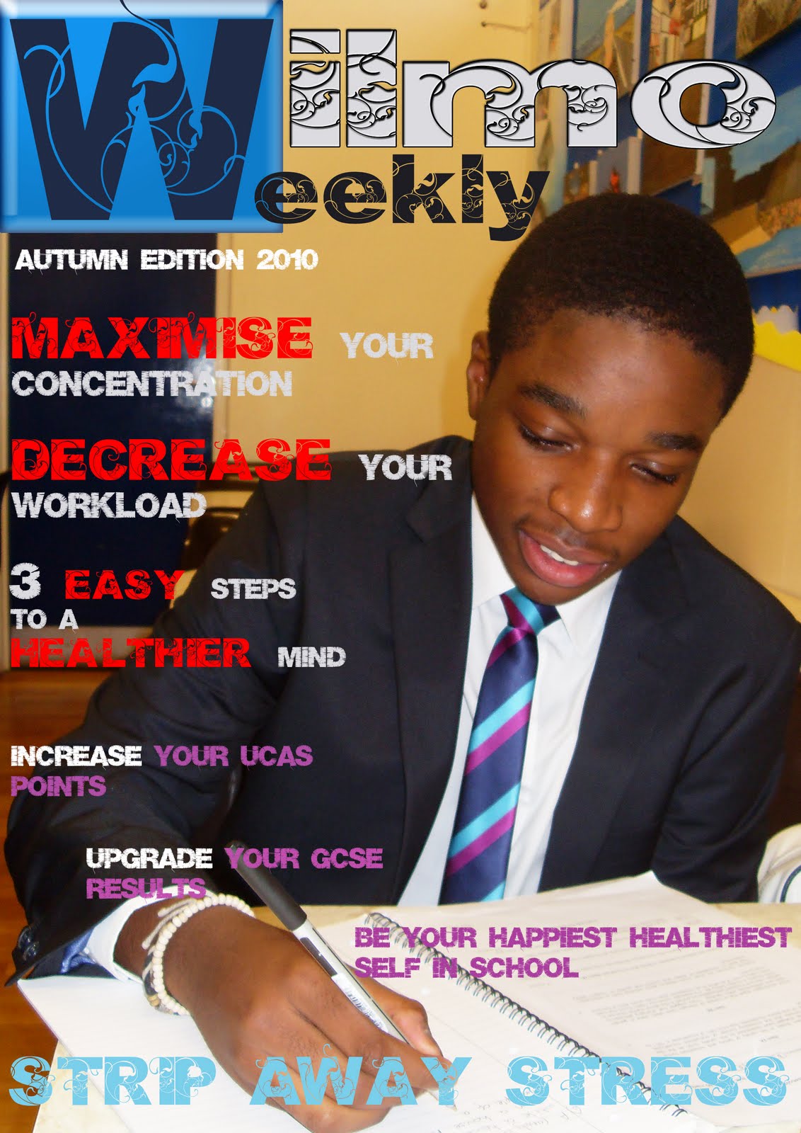 - The image of the boy is large and covers the whole magazine which shows good composition. The boy is very important as he is not covered.
-Imagery shows that the boy is working hard and looking very smart . This could catch the attention of many parents or carers.
-The color blue allows the W at the top left of the cover to stand out and makes it more effective by using different and unique typography
-Large cover lines with bright and bold colors can catch more attention from younger readers.
-Brief but relate able text all in capital letters
-Text is brighter than the image itself allowing the magazine to look more colorful and makes it easier to read.
-Colors of the text (blue, purple, and white) match with the boys tie so could resemble their school colors
-Colors of the text is used carefully making sure it stands out and is easier to read.
-Text is very basic and cover is not very informative..
-Aimed at those who are searching for a job.
-Although the name of the college is in capital letters and has its own place right at the top of the page it does not stand out enough.
-Background color contrasts very well with the color of the text.
 -School logo is added on the top left.
-Main colors that stand out on the magazine cover include blue,white,red and yellow.
-No information about the school other than it being an art college and a high school.
--Color of the text contrasts well with the color of the background.
-Three pictures the same size right in the middle of the magazine lined up together, pictures only take up the center of the magazine.
-All three pictures are of the young students that go to the school.
-No unique typography is used and the cover is very basic.
Friday, 2 October 2015
initial idea
- The initial idea for our magazine will be for a secondary school
- The format will be quite formal and informative but at the same time very interesting
- Cover will be eye catching, it will include a main background picture of the school
- Color scheme of the magazine cover will be the same as the school colors, e,g red, black and white etc
- It will also include some small pictures connected to the basis on whats on the cover
- A wide range of information for secondary school and sixth form
- The main background picture will have to co ordinate with the font especially the color as we want to put the text on the top of the photo which will fit together nicely
Subscribe to:
Posts (Atom)