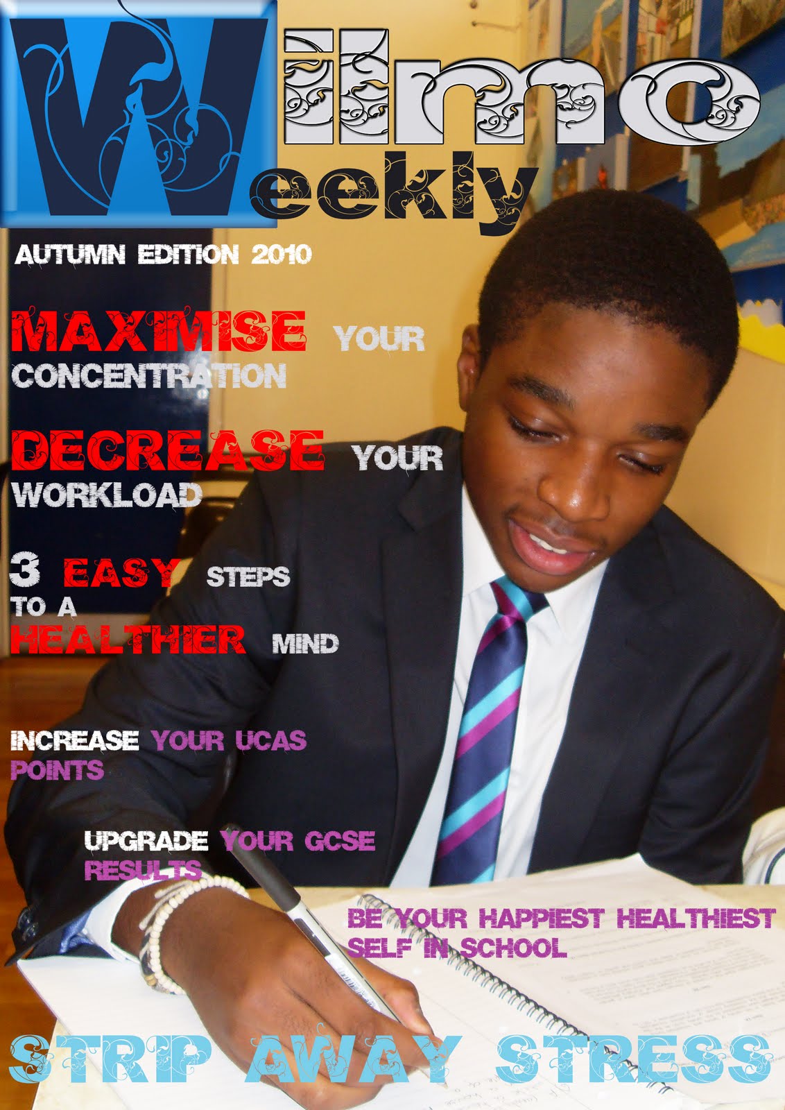
 - The image of the boy is large and covers the whole magazine which shows good composition. The boy is very important as he is not covered.
-Imagery shows that the boy is working hard and looking very smart . This could catch the attention of many parents or carers.
-The color blue allows the W at the top left of the cover to stand out and makes it more effective by using different and unique typography
-Large cover lines with bright and bold colors can catch more attention from younger readers.
-Brief but relate able text all in capital letters
-Text is brighter than the image itself allowing the magazine to look more colorful and makes it easier to read.
-Colors of the text (blue, purple, and white) match with the boys tie so could resemble their school colors
-Colors of the text is used carefully making sure it stands out and is easier to read.
-Text is very basic and cover is not very informative..
-Aimed at those who are searching for a job.
-Although the name of the college is in capital letters and has its own place right at the top of the page it does not stand out enough.
-Background color contrasts very well with the color of the text.
 -School logo is added on the top left.
-Main colors that stand out on the magazine cover include blue,white,red and yellow.
-No information about the school other than it being an art college and a high school.
--Color of the text contrasts well with the color of the background.
-Three pictures the same size right in the middle of the magazine lined up together, pictures only take up the center of the magazine.
-All three pictures are of the young students that go to the school.
-No unique typography is used and the cover is very basic.
No comments:
Post a Comment