Wednesday, 30 March 2016
Tuesday, 29 March 2016
Double Page Spread Screenshots
For my double page spread I started off by measuring the page on Photoshop making sure that it was the right measurement. I also deleted the background layer so that I could add my own colour.
I used a mid shot of the model and after cropping it, I placed it on one end of my page so that I could add enough text. As my pop music magazine was coming out in spring time, the model wore minimal makeup and colours such as pink to give it more of a spring vibe.
I used a baby pink colour to compliment what the model was wearing. Also, this colour would look more appealing to my target audience which was teenage girls.
On Photoshop, I used gradients to make my double page spread stand out more. The colours that I used matched what the model in the picture was wearing. Although I used similar colours, I made sure that the text, background and picture of the model caught similar attention.
The text reading "Vanessa Reed" which was the models name, was made quite big and bold so that it could stand out showing the audience what the double page spread was about.
It was hard to get one text colour to match the background so i used two different colours which were black and white. After analysing pop magazine double page spreads, I realised that they had one main image and a lot of text. I carried out this idea in my own magazine.
Contents Page Screenshots
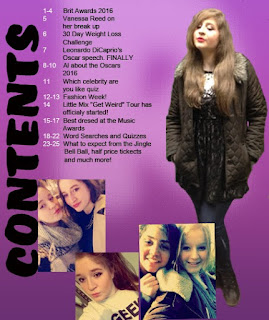
For the contents page, I used a bright purple colour which allowed it to stand out quite a lot and attract the attention of my target audience.
I got the idea of a sidewards rotated heading from billboard magazine. Their target audience was similar to mine and so I thought I would carry out this idea in my own contents page. I chose the colour white as it was one of the colours that contrasted the most with the background colour.
On SurveyMonkey, I asked if my magazine name should be included on the contents page. The majority answered no so instead I used the initial of my magazine name which was "R" and I added it to the background for a nice effect. I used the blur tool and free transform on Photoshop to make it big and to give it a slight faded effect.
The picture that I decided to use of the model was at a long shot. Making the model the same height as the main heading looked quite nice and professional.
I added more pictures to the contents page which made it look more like a pop music magazine and would appeal to my target audience. I also changed the colour of the word contents as I thought it looked better in black. Based on the results on SurveyMonkey, I numbered the text to make it look more professional.
Thursday, 24 March 2016
Front Cover Screenshots
This is the picture that I wanted to use for my front cover
of the music magazine. The reason I chose this picture was because I thought
that it would look good on the cover of a pop magazine. The colours worn by the
model are quite striking which gives it the pop vibe. The makeup was left
neutral but the lipstick worn was a bright pink and quite bold allowing it to
stand out more and so that it relates to the colour theme of the magazine front
cover.
I cut out the background using the rubber tool on Photoshop
as i did not want that included in my magazine front cover
The reason that i chose this pink as my background colour
for the front cover was because the main target audience was teenage girls and
i wanted to make it look quite feminine so that they can relate more to it.
It took some time to decide on the name of my magazine but
after doing some research i liked the name "RITA". It was short and
easy to read, also it goes well with the idea of a pop music magazine. After
looking at my results from the survey i put on Survey Monkey, i saw that most
people wanted the background to be slightly covered as it will look
professional so i carried out the idea on my front cover.
I added a bit of text and experimented with the fonts. I
thought that it would look quite plain if it only included text so i used the
rectangle tool on Photoshop to highlight specific words in a bright colour to
make it look more interesting.
I wanted to be a bit more creative so i added gradients on
Photoshop. This made it look less childish and more professional.
It was necessary to include a bar code on my magazine front
cover so i got one from the internet and added it to my magazine.
This is the final front cover of my magazine. I changed the
text to different sizes and colours making it look more like a pop magazine.
The colours that i used were quite bold and will easily catch the attention of
my target audience. Using the rectangle tool on Photoshop i made fun shapes
highlighting words that would be given more importance.
Subscribe to:
Posts (Atom)