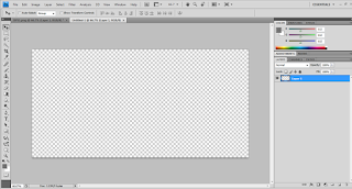
For my double page spread I started off by measuring the page on Photoshop making sure that it was the right measurement. I also deleted the background layer so that I could add my own colour.
I used a mid shot of the model and after cropping it, I placed it on one end of my page so that I could add enough text. As my pop music magazine was coming out in spring time, the model wore minimal makeup and colours such as pink to give it more of a spring vibe.
I used a baby pink colour to compliment what the model was wearing. Also, this colour would look more appealing to my target audience which was teenage girls.
On Photoshop, I used gradients to make my double page spread stand out more. The colours that I used matched what the model in the picture was wearing. Although I used similar colours, I made sure that the text, background and picture of the model caught similar attention.
The text reading "Vanessa Reed" which was the models name, was made quite big and bold so that it could stand out showing the audience what the double page spread was about.
It was hard to get one text colour to match the background so i used two different colours which were black and white. After analysing pop magazine double page spreads, I realised that they had one main image and a lot of text. I carried out this idea in my own magazine.


No comments:
Post a Comment