In what ways does your music magazine use, develop or challenge forms and conventions of real music magazines?
 After looking at several pop magazines and also analysing a
couple, I got an idea and planned out what I wanted my final pop magazine to
look like. Every pop magazine that I looked at had a specific colour scheme or
colours that would really complement each other within the text, background colour
and what the model was wearing. For my magazine front cover I decided that I
will use similar colours or different colours that complement each other for
the text and the background but also enough for the text to stand out. Also I
thought that I would match something that the model was wearing, such as the
colour of her lipstick with the whole colour scheme of the front cover so that
nothing would look out of place. The date, website and price of all music
magazines are usually in very small text and on top of the bar code which is usually
on the bottom right, this is one of the ideas that I carried out on my own
magazine. Pop magazines do not only include text but also include fun shapes
and striking colours allowing it to stand out and look much more quirky. Using
the rectangle tool on Photoshop, I added shapes to the text making it more
interesting to read. The idea of a covered title name on the front cover of my
magazine initially came from the magazine “Cosmopolitan”. I thought the idea made
it look very professional and I wanted to carry it out in my own magazine front
cover. Another thing that I added to my front cover which I thought looked
really good was the gradient tool. Without the gradient tool the front cover
looked quite UN finished and plain in some parts. As I added the gradient tool
near the end, I realised that it bought the whole magazine together and made it
look much better.
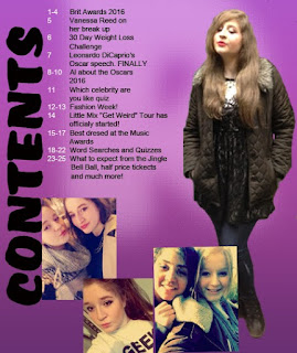
 For my contents page I decided not to add the name of my
magazine but to add the initial instead which was “R”. I made the initial quite
big but not too much just in case it draws away attention from the contents
page itself. The initial was behind all text and images, I also used the blur
tool to make it look slightly faded out and picked a similar colour to the
background so that it does not contrast. On my survey that I had carried out on
Survey Monkey, a lot of people voted for the text to be numbered and for there
to be multiple images which is what I then did. The word “Contents” is written
on the side of the magazine, I got this idea from “Billboard” magazine as I
really liked the idea and it thought that it would make the contents page look
very unique. To rotate the word “contents” I clicked edit, transform and then
rotated it to how much I wanted to on Photoshop. Pop magazines would usually include a lot of
pictures on the contents page to make it look more interesting. Although many
people voted for my contents page to include more text on my survey, it looked
less like a pop magazine when I did so I decided to add more images but enough
text to meet my audience’s opinions as well as my own.
Double page spreads on a pop music magazine usually include a
lot of text and an image of the model, the text is all about the model whether
it is an interview or just the latest gossip. I used this idea for my double
page spread and included an image of the model which took up a quarter of the
page, with news about the latest gossip and I also included bits of an
interview. After analysing a couple of music magazine double page spreads, I
noticed that the name of the model/artist was the only bit of large text on the
page. This is another one of the ideas that I decided to carry out on my own
double page spread. Also I chose two different colours for my text as I wanted
it to contrast a lot with the background and wanted to make it easier to read.
One of the double page spreads that I had analysed used text boxes as it was
really hard to contras a colour with the background. This was quite a unique
idea which I used in my own way by changing the colours instead.


